Perfecting collaboration in Studios

Capture One is a must-have software for professional photographers, ideal for studio work, particularly in fashion, commercial, product and portrait photography. 

Summary

Collaboration in studio setups was really limited for professional photographers and their teams. During Covid, the need for remote collaboration emerged and Capture One delivered a magical experience of sharing photos online during a shoot with CO Live. When covid ended, the need for CO Live decreased and we were back at limited collaboration in studio setups.

I was part of an ambitious project to redesign the way professional photographers collaborate with their teams during studio shoots.

To comply with my non-disclosure agreement, I have obfuscated and omitted from this case study anything confidential. All information is my own and does not necessarily reflect Capture One.

My Role

At Capture One I was responsible designing for smooth collaboration between professional photographers, their team members and their clients across their whole workflow.

I led the design of a real-time photo sharing experience, called Capture One Live for Studio, as a solo product designer.

I worked together with a Researcher, Engineering Manager, Product Manager to discover the opportunities and establish our business goals and with a small team of 3 engineers during development.

The project started on Oct 2023 and the app launched on May 2024

Problem Statement

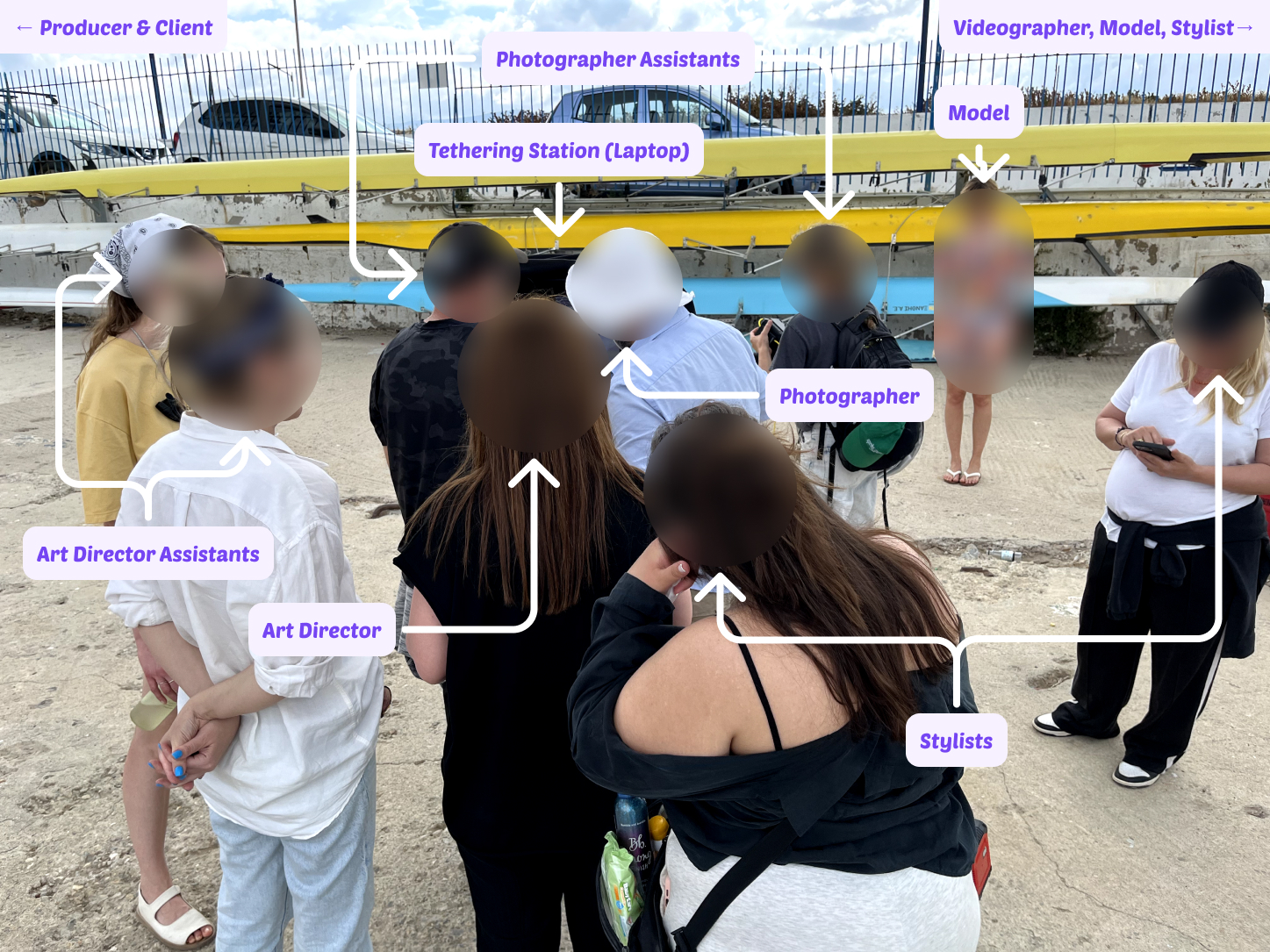
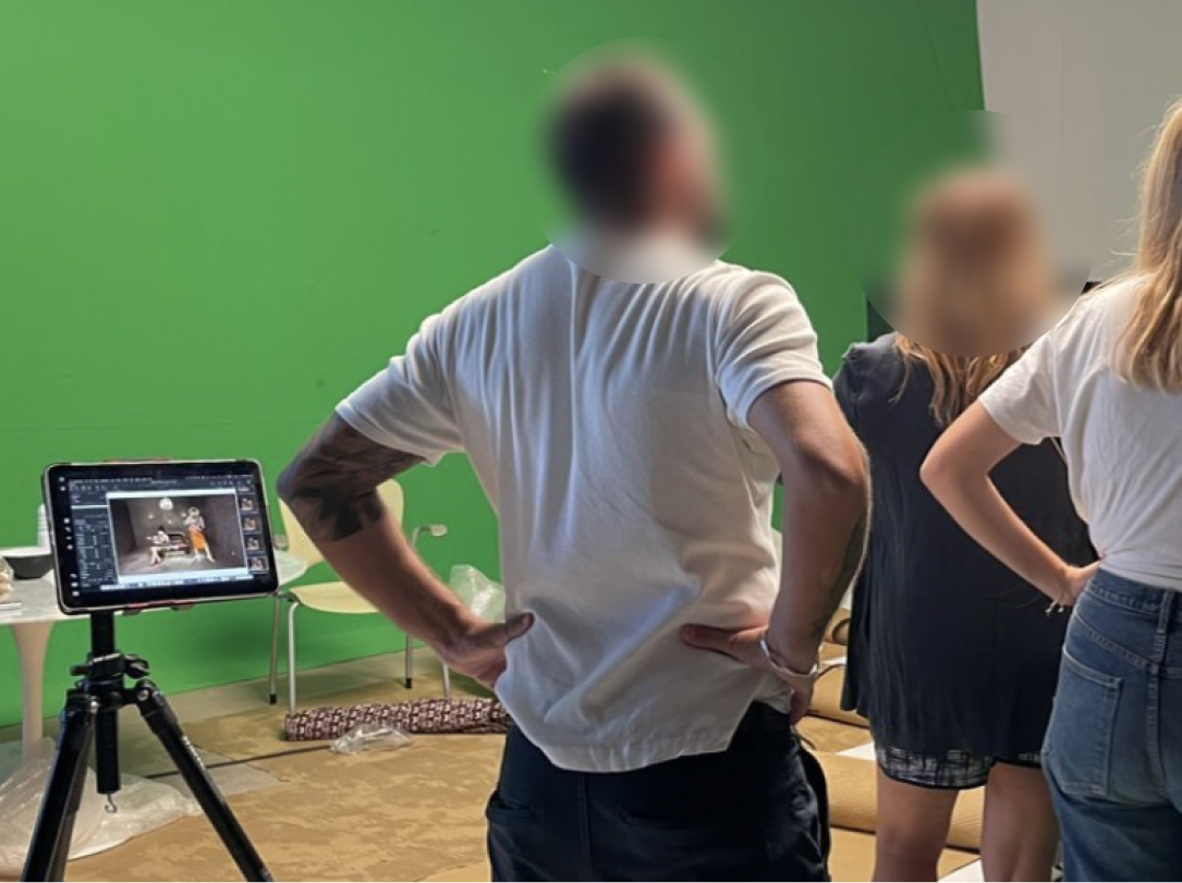
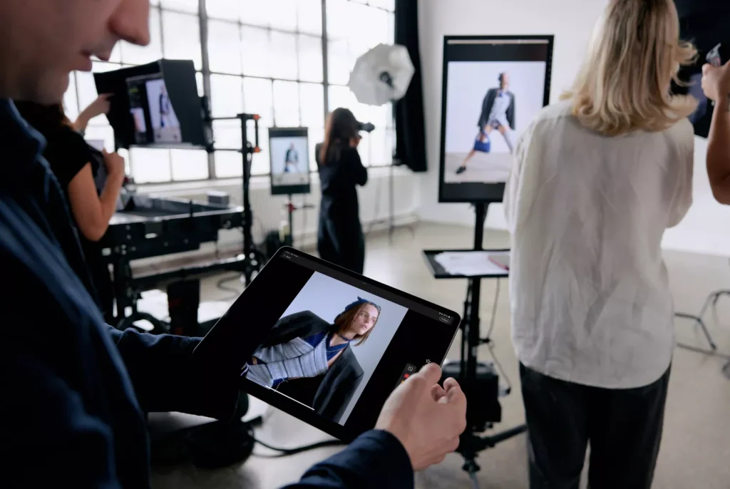
Capture One always had a functionality called “tethering”, which allowed photographers connecting their camera to their laptop and, while shooting, the photos were immediately transferred there. While this works great for small teams, it is not ideal for larger teams. In bigger productions, a team can consist of 10 or even more people, making the laptop a very crowdy place to be. (Image 1)

Back in 2019, when Covid started, the need for remote collaboration emerged. Capture One released CO Live, a new experience where professional photographers would be able to share photos online, during a shoot. CO Live transformed the way photographers would collaborate remotely. However, when covid ended and all collaborators returned on premise, CO Live struggled supporting collaboration in the fast paced environment of a studio photoshoot.

Image 1: Large Team Studio Setup

Challenge

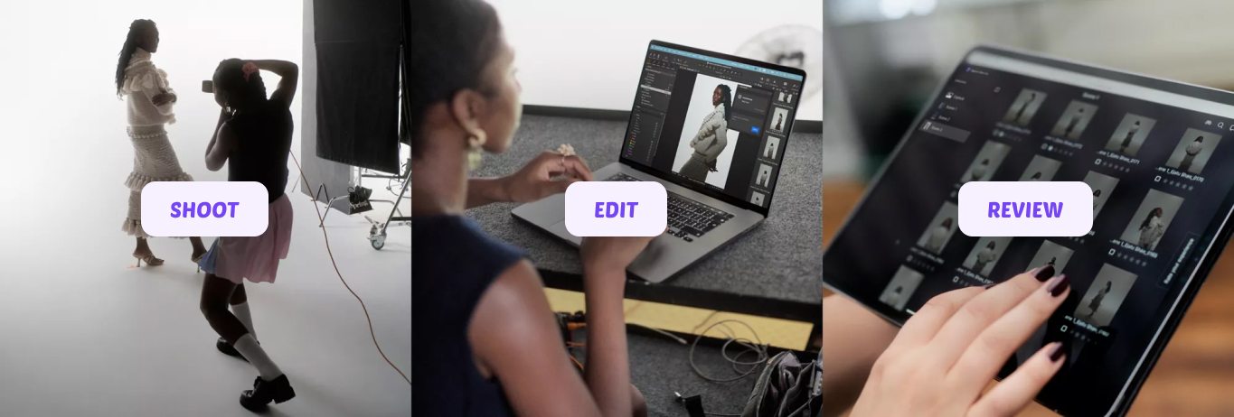
Our goal for this project was to elevate the way larger teams would collaborate during a shoot. The premise was: the photographer takes a photo, the assistant edits it on the tethering device, the team reviews on a mobile device.

Our high level goals were to make something:

  1. Fast: Make it render high quality photos fast.
  2. Easy of Use: Make it easy for everyone.
  3. Stable: Ensure that it is reliable at all times.
  4. Pressure free: Ensure that we decrease the number of eyes from the tethering device.

Research and Discovery

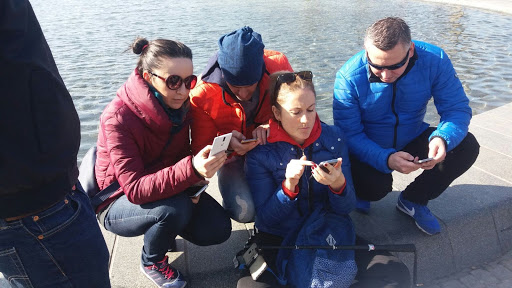
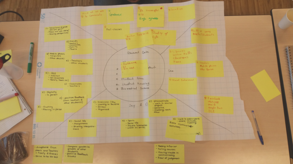
With the help of our researcher Andreas, in Capture One, we established a continuous research approach, where everyone from the design team gets to observe and record field studies. This allowed us to start with a good understanding of the situation during a shoot while I also conducted interviews, to find out more targeted nuances and pain points.

Combining the pre-existing insights from field studies, together with the followup interviews, my team was able to have a clear mission and specific goals for our project.

What our research showed was that in each shoot, the Art Director is the one that reviews the photos and makes sure that “they have the shot”. What we observed is that there are 2 use cases in each shoot, where the Art Director needs to check the photos.

1. Passive Observation

The Art Director wants to observe the shoot and ensure that things are going according to plan and the feedback towards the photographer and the model shows on the photos.

2. Active Review

The Art Director wants to review previous photos from the current or past sets and select the best ones, while the shoot keeps going.

With the current way of collaboration available, the following problems surface.

  1. CO Live is unusable in cases where the internet connectivity is limited, making the transfer of photos very slow. Creating huge delays in the 1st use case. If internet is non-existent, it also doesn’t allow for the 2nd use case to take place as well.
  2. The Art Director can only see what the assistant sees, making it difficult for the assistant to work on a specific photo while the Art Director wants to review previous photos. This creates a bottleneck in the 2nd use Case.
  3. Many photographers had created workarounds to support a local collaboration flow, via screen sharing apps, to reduce the number of people looking at their screen while they work. However, people would still prefer to look at the laptop where the screen was bigger and the action was happening.
Image 3: Sharing the screen of the laptop on an iPad just didn't cut it

Design Process

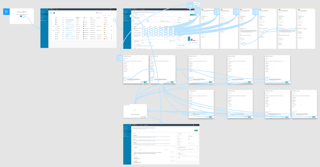
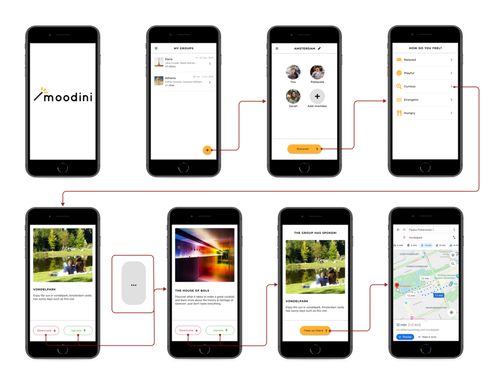
User Flow Information

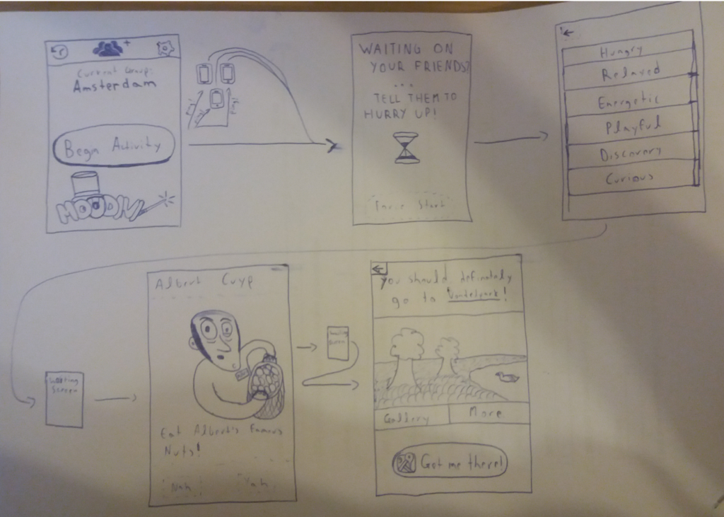
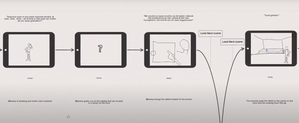
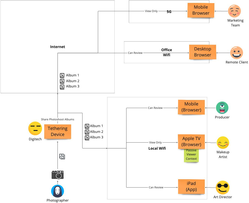
I designed the flow (Image 3) based on the larger vision of where we wanted this collaboration experience to go. The idea was that everyone can access the shoot from any device and any network, allowing for both local and online collaboration at the same time. Merging the new experience with the existing experience of CO Live.

However, for the first iteration of the product we adopted a much simpler approach that allowed collaboration to occur either online or locally and only from an iPad.

We named the app “CO Live for Studio”, with the intention of merging it with “CO Live” in a future iteration.

We chose to start with only an iPad app because, interestingly enough:

  1. at least one iPad is found in most studio setups
  2. its screen is large enough to increase the confidence of Art Directors when reviewing the photos.
Image 3: Information Flow Diagram

Design Prototypes

I designed CO Live for Studio having both use cases in mind.

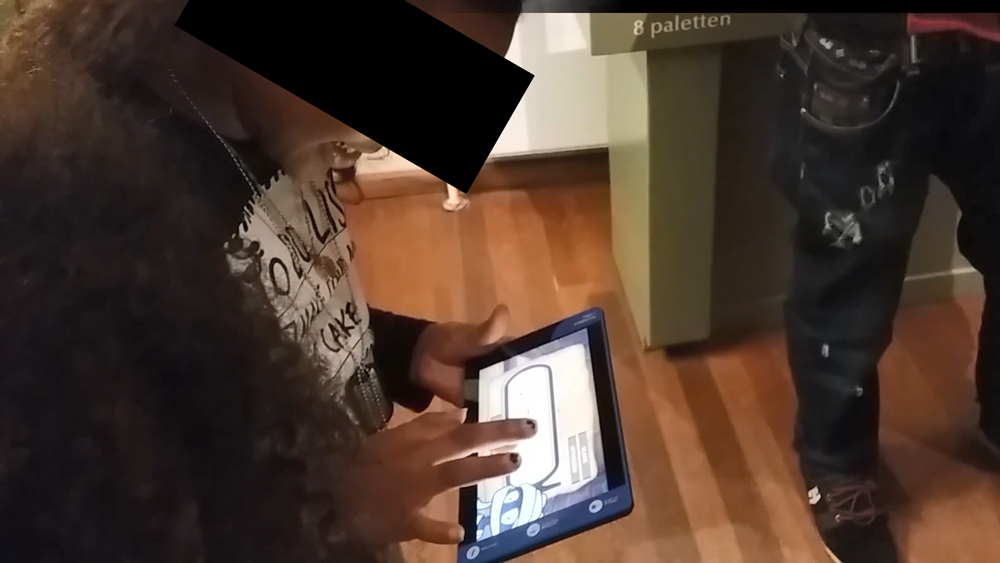
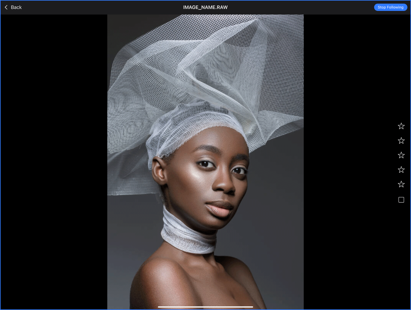
  1. Passive Observation: I designed an experience that allows for a passive “follow” mode, following the shoot as it happens, with 0 clicks. Much like tethering transfers a photo from the camera to the laptop, the laptop transfers it to the mobile device via the local network, even if the local network has no internet access at all (Image 4).
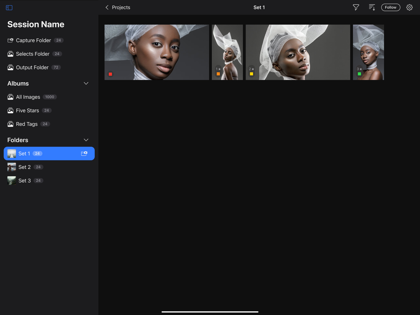
  2. Active Review: The photographer decides, which albums can be seen on the iPad app. Then the Art Director can freely move between the photos of any shared set (Image 5).

For the UI and interaction, I used the same patterns I had designed back in 2022 for the “Capture One mobile” app. Both “Capture One mobile” and “Live for studio” had a similar visual experience, so we had already worked and tested these areas a lot during these past 2 years. An added bonus was that we got to maintain consistency.

Image 4: Follow mode was ideal for passive observation
Image 5: Shared Photoshoot Albums

Testing

We tested the app using a working prototype made by our team. With the help of our colleagues in Copenhagen, we distributed a closed beta to a select group of studio photographers for testing.

I recommended this approach for 2 key reasons:

  1. The app’s nature: This app relies on a local network to transfer photos between devices. If you add extra factors such as the fast-paced environment of a photoshoot, the pressure to deliver results, and the presence of numerous people, testing it differently creates huge challenge in both result accuracy and practicality.
  2. High confidence: Our extensive research gave us strong confidence and deep insights into the collaboration related problems happening during a studio shoot. As an extra plus, this accelerated the delivery as well.
Image 6: testing CO Live for Studio on the field

Outcomes and Reflection

On May, 2024 the CO Live for Studio app was released as part of bigger launch with the goal of supporting the studio workflow—an impressive achievement by the team, considering that it was a total redesign in the way collaboration happens in studios in only 6 months.

Around 40% of all studio users use Live for studio daily, with an average duration of 2 hours, making it one of the top studio workflow tools Capture One released and the main driver for Studio subscriptions.

I'm excited to use features like Live for Studio and Client Multi-Viewer, making image sharing and receiving feedback from clients and creatives much easier.

First off, can I just say thank you for all your efforts on Studio - particularly with the new Live iPad app - I ran it properly for the first time on a big shoot last week and it ran almost completely flawlessly across 3 iPads over 4 days. Excellent stuff.

The new Live for Studio app adds a reliable and efficient way to collaborate with art directors and clients.

Improving Threat Detection in cybersecurity

SOCStreams is one of the most established cyber-security incident response systems for managed service security providers (MSSP) in Europe and Middle East. 

Summary

Cybersecurity analysts more often than not need to categorise hundreds of incidents between false positives and real threats. When SOCStreams provided a large amount of information to analysts, it failed to provide the important information based on the type of the incident, driving analysts away from it, using different platforms to fulfil that need. In return, analysts were loosing time moving between different platforms to find what they were looking for.

I was part of a project to increase the confidence of analysts when investigating the severity of an incident within the platform.

To comply with my non-disclosure agreement, I have obfuscated and omitted from this case study anything confidential. All information is my own and does not necessarily reflect Capture One.

My Role

I led the initial user research and defined the key personas, I created the interaction design of our prototyped solution, and I helped evaluating our design through a series of usability tests I conducted.

Solution

We based our strategy on the design thinking methodology, which includes 5 steps: empathize, define the problem, ideate, prototype and testing. We eventually designed a solution that allowed analysts to understand quicker the nature of incoming threat alerts.

Empathize

To be able to frame an analyst’s point of view I conducted an 8-hour field research with a security team of 9 members (1 Manager, 1 level-3, 4 level-2, 3 level-1 analysts) and conducted interviews with 9 level-1 and 5 level-2 analysts. The field research would allow me to see in person what a security team’s day-to-day job consists of, which are their goals and what their pain points. The Interviews would provide me additional in-depth context of who analysts are and how they feel and think.

In addition, we invited a level-2 analyst to showcase us the process followed during threat detection, investigation, and communication with the MSSP’s clients. We decided to invite a level-2 because he was responsible in training level-1 analysts. The showcasing helped my team and I to deeper understand the process an analyst would follow during an actual threat.

Personas

Based on the data collected during the field research and the interviews, I created 2 key personas that would help us maintain focus on the real challenges analysts overcome during the detection process of a threat.

The 2 personas were:

  • Detector Dennis
  • Expert Evan

Detector Dennis is part of the level-1 analyst team. He is responsible for going through the stream of incoming Alerts, distinguish potential threats from false positives, and building a case using various indicators of compromise. If the threat is too complicated for him to handle, he will escalate it to a level-2 analyst.

Detector Dennis, level 1 analyst, age 27

Expert Evan is a level-2 analyst. Among other things, he is mostly responsible in supporting level-1 analysts with difficult cases and communicating all cases created by level-1 analysts to the MSSP clients. He is also responsible in collecting all lessons learned during a case and translating them into use cases and playbooks.

Define the Challenge

In general, threat detection and investigation is a time consuming process during which an analyst has to go through a huge stream of incoming alerts,distinguish potential threats, Scout them further to exclude any false positives, and investigate positive threats further to create a Case. Some of the greatest challenges we had to consider were:

  • SOCStreams alerts provided all the appropriate indicators an analyst would need to build a case. However, it didn’t provide enough context to help analysts detect threats.
  • Analysts would use both alert indicators and prior knowledge to detect a threat.
  • Analysts would usually use past alerts or closed cases as prior knowledge, and not as much use cases or playbooks.
  • Different indicators might have different importance depending on the threat at hand.
  • External investigation systems provide a great amount of details for both detection and investigation. However, our product mission resolves around threat detection, casing, archiving and communication.

Solving these challenges would help us increase the usage of alert section. So, how might we provide analysts with enough context in order to support quicker threat detection?

Ideate

At the beginning, we used the W4 method to help us clearly define the problems at hand and to make sure that everyone on the team is on the right page. Together, my team and I conducted a braindumping session that helped us generate multiple ideas. This method also allowed us to identify overlapping concepts, evaluate old and bold ideas, and come up with a solution that seemed to solve the challenges at hand.

Our solution was based on the assumption that the analyst would still use external investigation systems to further investigate positive threats. However, most incoming alerts are false positives or non-issues and only a few are incidents.Thus, providing analysts with enough indicators in combination with the knowledge of past alerts and cases would help analysts detect a positive issue. This would ultimately decrease the need to use external investigation systems for most alerts.

Prototype

I created an interactive prototype in Figma using our SOCStreams components. With the help of George, an awesome security expert on our company, we managed to populate our prototype with near real data of threats that he generated for the needs of prototype testing. That would help us test our idea in a situation that tries to mimic a real life situation both in the field of data and aesthetics.

Test and Evaluate

In total, I conducted 5 usability tests using the System Usability Scale for measurement. 2 with level-1 analysts, 3 with level-2 analysts that were promoted from level-1 during the last month. That helped me analyze how the solution affects the decision making process of both experienced and inexperienced analysts and also provided me with numerical data that could help me support my claims to the other stakeholders that were not present during testing.

In our testing, we validated our assumption that analysts would eventually need to use investigation systems during their investigation drill down. We also confirmed my assumption that analysts will be able to detect a cyber-attack or a false positive, before having to use an investigation system. This would eventually allow them to cut down on the extensive use investigation systems limiting it to only when necessary, and ultimately decreasing the fragmentation of information input from various sources.

Conclusion

Framing a point of view based on such a niece group of users was a great challenge on its own. I learned that I can solve this challenge by addressing a problem through the eyes of a novice analyst. During the various process cycles, I never stopped looking for meaning in the actions of analysts. I would watch videos of how to setup an investigation system to get meaningful alerts, how to detect specific threats, and what to do to contain them. This perception of things allowed me to immerse in the job of an analyst so I could come really close with the real challenges they face.

I also learned that to solve great problems you need to consider the superpowers of people outside of your general scope. If I never considered to ask the help of our cyber-security specialist, I wouldn’t be able to test the prototype with near real data. That could lead to a path where the usability results would have contained somewhat misleading results, ultimately prohibiting us from focusing on the important feedback that we received.

Iterative user research led us to a solution that seems to provide enough context and content to allow analysts get a good understanding of what an incident is about. Based on the System Usability Scale results, participants evaluated the solution at 70 points. That means that while the solution can benefit them in their work, it can still grow in the future to provide more value. We are currently on the process of developing a beta version in order to collect quantitative data and see how analysts respond to the redesigned section, under day-to-day stress. This will allow me to work on improving its interaction elements, based on tracking and continuous feedback.

For a first evaluation of an alert, this feature seems useful. You can definitely get an idea of what is going on, and it has nothing to do with the previous design for sure!

It does get you a large percentage of the information I’ll need to draw conclusions, I would say about 80%. Now, I have to say that this info is good enough to get a first taste of what is going on.

Re-Imagining Trips in Amsterdam

Summary

Tourists traveling in groups to Amsterdam prefer autonomous travel instead of pre-planned vacation packages. However, due to poor planning, they end up visiting only a few main attractions, while the rest is discovered through hours of online exploration while moods and personal preferences collide.

I was part of a project to re-imagine the way people explore Amsterdam with their friends during a trip.

To comply with my non-disclosure agreement, I have obfuscated and omitted from this case study anything confidential. All information is my own and does not necessarily reflect Capture One.

Based on our field research we discovered that tourists between the ages of 20-35, traveling in groups prefer autonomous travel instead of pre-planned vacation packages. However, the planning they conduct before a trip is rather poor, including only visiting some main attractions, while the rest is discovered through hours on looking at places and reviews online while moods and personal preferences collide.

Solution

We set out to design a new mobile application that would stimulate tourists to quickly be exposed to new experiences in Amsterdam and support group decision-making. That would ultimately allow them to spend more time on the experience of a trip rather than on searching for that experience.

My Role

My team and I worked together on all aspects of the design of this mobile application. I helped in conducting the initial user field research and defined the key needs and motivations of tourist groups in Amsterdam. I also conducted usability tests, together with my teammates, that helped us evaluate our product during 2 different design iterations. I also participated during the the refinement of the various prototypes and the creation of a functional alpha version.

Note: UX projects don’t follow a linear methodology. For the purpose of this case study, I will describe the work done, through the various phases, in a linear structure.

Empathize

We established a field research in order to understand the pain points that tourist groups have. As part of a team effort, we conducted 11 guerrilla interviews with tourist groups, in order to acquire helpful insights about how tourists perceive a traveling experience. The groups consisted of 2-6 people, at the ages of 20-35, from various countries of Europe and the US.

Personas

Based on the collected data, I identified and created 2 key personas that would help us visualize the challenges a tourist has to overcome during his visit and prioritize our solutions based on their needs.

Define the Challenge

During the interviews the most common challenges we encountered were around collective decision making and downtime spent on searching for new experiences. More specifically we discovered that:
  • Due to the variation in preferences and moods, decision making can become tiresome.
  • Some people trying to get the upper hand in planning can cause tension in the group.
  • Existing apps, with lists of nearby places and reviews, are being used but they require spending a lot of time and ultimately tiring the group due to the number of results. (Hick’s law in action)
  • Searching for hours on an app needs data, thus, tourists preferred to go to a place with Wi-Fi and spend some time there until they find their next traveling experience.
  • Some groups prefer to avoid apps and just walk around until they discover something interesting. They state that this feels spontaneous and adventurous but ultimately they feel they lose a lot of time.

Ideate

We used rapid sketch prototyping to generate various and diverse ideas as a group. This allowed us to rapidly iterate and fail fast by quickly going through multiple options. We evaluated each solution and we concluded that one of the ideas I had could have a positive effect in both decision making and time spent.

The idea revolted around the collective feelings of the group and suggested relevant places, spending no more than a few minutes, the group could quickly select their next experience. I suggested the app name Moodini because like Houdini it’s all about magically getting out of a difficult situation.

Prototype, Test and Evaluate

To evaluate our assumptions, I created a testable paper prototype which consisted of a few feelings and recommendations on small pieces of paper. As a team, we conducted a guerrilla test of the system on Six groups from various countries.

To get more confident results we conducted the testing outside of Rijksmuseum, one of the main attractions in Amsterdam. That allowed us to screen our participants and ensure that all groups had just exited the museum and had no idea where to go next.

Based on the feedback we received we adjusted our solution and went on creating a higher fidelity prototype that could be tested on mobiles. I worked on adjusting the feelings and recommendations and together with Pasquale and Willem we worked in designing and developing the high fidelity prototype.

As part of a team effort, we conducted 6 additional guerrilla usability tests with tourist groups from various countries, outside of Rijksmuseum. Overall, the testing validated our assumptions, except some details. Participants characterized the application as convenient, fun, quick and helpful and asked us with directions on how to get to the place suggested, since the prototype maps were not providing real data.

Conclusion

The conceptualization of Moodini was one of my favorite projects, however it became clear to me that the testing and evolution of a digital product never stops. We asked questions about our assumptions and we received answers, however, we also received different challenges. How could we let tourists know that there is an app for a similar problem to theirs? How might we tackle the cold start problem? How can we actually link effectively feelings with places? etc. etc.

The Design thinking framework helped me to stay focused and on track throughout the whole process. What we managed to achieve was to get an accurate glimpse of the future and how an application like Moodini could provide value to the struggles of tourist groups in Amsterdam, without spending resources beforehand.

Engaging and Educating Children in a Museum

Introduction

Challenge

The Allard Pierson Museum of Amsterdam possesses a rich collection of archaeological artifacts, a large part of which is dedicated to the civilization of ancient Egypt. The goal of the museum is to engage and educate visitors; however, the hardest to educate are children that would mostly be forced to visit the museum and would end up wandering the museum’s halls.

Solution

To solve that challenge, we based our strategy on the 5 steps of design thinking: empathize, define the problem, ideate, prototype and test. We set out to design an interactive installation for the Egyptian exhibition that would encourage children engagement and ultimately would educate them about the fundamentals of the hieroglyphics language.

My Role

My team and I worked together on all aspects of the design of the new interactive installation. We all equally conducted initial user research and defined the key needs and motivations of children in a museum environment, I created the first interaction of our low fidelity prototype and I also helped evaluate our installation through usability tests before and during the Alpha state of our project. An amazing team from the Media college of Amsterdam, with which we collaborated, developed the Alpha version of the product.

Note: UX projects don’t follow a linear methodology. For the purpose of this case study, I will describe the work done, through the various phases, in a linear structure.

Empathize

Having a completely different state of mind from adults, children were a really challenging user group. We conducted desk research in order to understand how children perceive their surroundings, how we can educate children and how to get their attention. In addition, we observed children in the museum premises in order to understand how they interact with the museum and what grabs their attention.

Based on the collected data, we created an empathy map that would visually communicate to us at all times: how children think and feel,what they see, hear, say and do, what they expect to gain, and what would frustrate them.

Define the Challenge

Using the data collected by the Museum and the bibliography,in addition to an empathy map that would help us identify the needs ofchildren, we defined 2 main challenges:
  • Children are not very interested in museums, they feel that they have to go.
  • Children have a very short concentration span when bored.
However, we collected some insights about children that later on helped us turn the aforementioned challenges into opportunities.
  • They are curious when engaged in an activity that they perceive as interesting.
  • Prefer learning through story telling and interaction.
  • Want to touch museum exhibits.
  • Tend to be competitive with each other.

Ideate

We used the crazy 8s technique to generate ideas. This method provided us with a variety of options that we could spin through and evaluate. We evaluated all ideas and one of the ideas I proposed stood out the most during dot voting. We merged a few aspects from other ideas that could enhance the initial experience and we decided on a final idea that could potentially succeed to engage and educate children.

Our idea was to create an interactive installation that would use mini-games and storytelling to teach the use of hieroglyphics to kids. Providing challenges in the form of mini-games would enable learning through interactivity. Continuous storytelling would allow children to invest more time in mini-games and capture their attention for a longer period. In addition, we included an avatar that would be relatable and could act as guide to the story.

Prototype

To quickly evaluate our idea I prototyped it and we tested it with adults. That would give us some first insights on how our idea can have an impact on learning and engagement. Without much effort, we could implement any vulnerabilities in our next prototype iteration.

After some adjustments with the mini-games, we needed to include the story. As part of the team effort to incorporate the story at a clickable prototype, I created story outline that we all later on populated and revised on a storyboard. The storyboard would clearly convey to us how our story flows thus, allowing us to work on our prototype without distractions.

Based on the storyboard, I created the medium fidelity prototype while Corine would revise and translate the story dialog to Dutch.

User Testing and Evaluation

To assess the quality of our prototype’s learning outcomes and engagement, we tested it 3 times. The first time we focused on learning outcomes and the second time on engagement and aesthetics. Based on the feedback we received, we confidently iterated our design on a usable demo that we also tested later on. The third testing focused on both engagement and learning outcomes.

Knowledge Outcome

Nout and I separately performed 2 tests with children (age of 9 and 12), at a controlled environment. I created the testing scenario that was separated into 2 parts. During the first part children were requested to answer a few questions about hieroglyphics after watching 2 minute video. One week later, during the second part children had to answer the same questions after playing through our prototype. This method would clearly show to us if engagement could enhance the learning outcomes. Our testing confirmed our assumptions regarding knowledge gaining.

Engagement and Aesthetics

As part of a team effort, we conducted 12 usability tests with children between the ages of 7 and 12. I was responsible to note reactions (since I wasn’t speaking dutch), while Corine would go through the process with parents and kids. Nout and Chris would note down any comments about the prototype experience. Various feedback sources could help us eliminate any subjective assumptions perceived by a single person during testing.
Based on the feedback received, we adjusted the experience and proceeded with the creation of a demo. We assigned the development of the demo to an exceptional team of graphic designers and game developers from Mediacollege Amsterdam. The goal of the demo was to be aesthetically appealing to children and to be tested with children in the museum premises.

Conclusion

Educating children in an informal environment, and entertaining them at the same time has proven to be a great challenge, which I found that could be overcome by performing extensive user testing.

I learned that small steps are necessary when trying to make big changes. It seemed clear that without breaking down the testing into smaller parts, it would be difficult to understand how each aspect of the solution would affect the final outcome. It was also obvious later on that if we had neglected the evaluation of our idea during the ideation process, we would have missed to consider that the mini-games alone would have been without particular value if we didn’t consider the whole journey through storytelling.

Our final design was successful. Iterative prototyping and user research led to a final product that managed to increase hieroglyphic awareness and use of hieroglyphic fundamental rules in children. In addition it managed to engage and immerse the children in the story making children to want to invest more time in the whole experience.

"I like that I am in Egypt solve riddles!"

"I am sad that this is not finished because I want to help the mummy enter it's tomb"

Help me be Better

I want to know what you think!

Please take 5 minutes to complete this form, and help me grow as a User Experience Designer. I would really appreciate your help.

[caldera_form id="CF5eec8cf5103f6"]